Based on Hunterbrook Media’s reporting, Hunterbrook Capital is short $ENSG and long a basket of comparable securities at the time of publication. Positions may change at any time. This article is not investment advice or a recommendation to buy, sell, or hold any security. Hunterbrook Media is collaborating with organizations like law firms including Hunterbrook Law to pursue reform based on this reporting. See full disclosures below.
This is the methodology supporting Hunterbrook Media’s investigation of The Ensign Group ($ENSG).
Hunterbrook analyzed Centers for Medicare & Medicaid Services (CMS) data to estimate the dollar value of understaffing CMS-certified nursing facilities. Then we carried out additional analyses to probe industry trends and examine the nation’s largest chain of certified nursing facilities. The numbers presented here are estimates. CMS data is routinely updated and may have gaps. What’s documented here reflects the data available and experiment design choices we made when we conducted this research.
Lorem ipsum dolor sit amet, consectetur adipiscing elit, sed do eiusmod tempor incididunt ut labore et dolore magna aliqua. Ut enim ad minim veniam, quis nostrud exercitation ullamco laboris nisi ut aliquip ex ea commodo consequat. Duis aute irure dolor in reprehenderit in voluptate velit esse cillum dolore eu fugiat nulla pariatur.
The Multimillion-Dollar Staffing Gap
CMS reimburses skilled nursing facilities (SNFs) on the basis of resident care needs rather than solely on the services they provide. Those care needs are also referred to as an acuity level. The vast majority of Ensign’s certified nursing facilities are SNFs.
This system builds in an incentive for nursing homes to cut costs by taking high-need residents while understaffing. In its 2025 10-K, Ensign even said it’s focusing on very sick people to increase reimbursement from the government. As part of our investigation, Hunterbrook Media estimated the profit a nursing home could pursue by understaffing for the level of its residents’ conditions.
We used data from two sources: 1) CMS Provider Information, which lists the number of staff hours provided by CMS-certified nursing facilities with the aggregate acuity level at each facility, and 2) the Healthcare Provider Cost Report Information System (HCRIS), which gives the cost of nursing services at each facility certified by CMS.
We also used a recent peer-reviewed study by a group of researchers including Charlene Harrington, a registered nurse and professor emeritus of social and behavioral sciences at the University of California San Francisco, and Robert McLaughlin, a healthcare data analyst. The study presents a formula1 to convert an acuity level into an expected number of staffing hours a facility should provide its residents. This formula was developed based on CMS-commissioned research, and CMS has used these studies to set Medicare payment rates.
Using this formula, we quantified a staffing gap — the difference between the actual staffing hours a facility provided and the number of hours the facility should provide, based on the needs of its residents.
Next, we used cost reports to calculate what that staffing gap amounted to in dollars. This figure told us how much a facility gains by failing to staff properly as determined by CMS-commissioned research.
Our analysis included all nursing facilities certified by CMS, as reported in the Provider Information data, including the facilities affiliated with Ensign. The analysis covered July through November 2024, a time frame based on data availability. Our methods were reviewed by three independent subject area experts, including the authors of the formula Hunterbrook used in this analysis — Harrington and McLaughlin.
Federal law requires nursing homes participating in Medicare or Medicaid to provide sufficient nursing staff to meet residents’ needs, taking into account “the number, acuity and diagnoses of the facility’s resident population.” In other words, the staffing obligation does not depend on which payer is writing the check.
The Math
We ultimately analyzed data from every certified nursing facility listed by CMS; but we began with a single Ensign facility, Riverbend Post Acute Rehabilitation.
Riverbend is a special focus facility — a designation for the worst-performing facilities, at risk of being terminated from the Medicare and/or Medicaid programs. We took the five months of Provider Information data available for Riverbend and calculated:
- Mean reported total nurse staffing hours per resident day = 3.7
- Mean case-mix index = 1.25
We plugged those figures into the formula published in the 2025 research study, using the same variables:
For Riverbend, that translates to:
We compared that total nursing HPRD (“hours per resident day”) to the mean reported nurse staffing and determined a percentage difference. We treated the percentage gap between those two figures as the share of nursing care expected but not delivered:
That means Riverbend reported about 22.72% fewer total nursing hours than expected given the acuity of its residents.
We then pulled the latest 2024 HCRIS cost report for Riverbend and took:
- Average hourly wage from Worksheet S-3 Part V, line 4, column 5 = $33.36
- Adjusted salaries from Worksheet S-3 Part V, line 4, column 3 = $4,655,887
- Adjusted salaries from Worksheet S-3 Part V, line 17, column 3 = $12,328
- Total patient days comes from Worksheet S-3 Part 1, line 8, column 7: 44,350
- Total patient revenue is from Worksheet G-2 Part I, line 14 = $17,924,836
We summed the two salary amounts to determine total nursing salary amount, setting aside separate wage-related costs:
We estimated the nursing cost the facility would have incurred per patient day if it had staffed to resident need by multiplying our derived expected HPRD by the reported average hourly wage:
We then estimated the facility’s actual nursing cost per patient day using its reported salary data:
The difference is our nursing staffing gap per patient day.
We then scaled that daily gap to the PBJ period we could actually observe given the limitations in the CMS data available. Across Riverbend’s five full-coverage PBJ months, we saw 16,756.5 patient days.
So, using this method, Riverbend gained an extra $915,824 during the July through November 2024 period by staffing below the level its residents’ conditions required.
This was also expressed as a share of patient revenue:
The Result
Riverbend’s visible-period understaffing profit equaled about 5.11% of its total patient revenue. Put differently: For every dollar Riverbend took in as patient revenue, a little more than 5 cents would have been needed to close the nursing staffing gap.
We also calculated the median values from staffing data, conducted the same math, and arrived at $986,284, or about 5.5% of total patient revenue.
We performed the same math for every month from July 2024 to December 2024 for each skilled nursing facility nationwide as reported in the CMS Provider Information data, including all of the Ensign facilities listed, and summed only positive values.
To ensure we correctly flagged nursing facilities belonging to Ensign during our study period (July-November 2024), we cross-checked each CMS Certification Number (CCN) on our spreadsheet flagged as “Ensign” with current ownership records, and omitted 22 facilities from our spreadsheet that were reported as acquired during and after this study period, at the time we conducted the analysis. We confirmed each acquisition with CMS change of ownership data. We were left with a total of 301 Ensign facilities and 13,347 others.
The gains from understaffing added up to $6.5 billion for all 13,670 certified nursing facilities nationwide as reported in CMS provider information data for our study period – that works out to a median value of $379,622 per facility.
That included $161 million for 301 Ensign facilities, which we estimated were behind 5,248,725 hours, after setting aside 22 facilities acquired during our observation period. This is all during a five-month period!
We compared the staffing gap for Ensign locations against non-Ensign locations with a Welch t-test of means, Mood’s median-test, and a Mann–Whitney test of distribution.
Each showed p-values beneath .05, so we concluded Ensign locations post these gains at a rate significantly higher than their peers. In particular, the Mann-Whitney test suggests if an Ensign facility and non-Ensign facility were chosen at random, there’s a 63% chance the Ensign facility has a higher staffing gap.
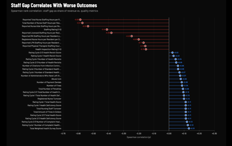
Fewer Nurses Correlates with Worse Outcomes
As described above, Hunterbrook calculated how much all certified nursing facilities reported to CMS profit by staffing below the level research informed by CMS studies recommends for their residents’ conditions.
Based on expert interviews and lawsuits alleging that residents had suffered due to understaffing, we looked into whether CMS-certified nursing facilities with a larger staffing gap performed worse. We compared each facility’s performance on quality metrics to the size of each facility’s staffing gap, taking the revenue from overpayment as a share of patient revenue.
For most, Hunterbrook found, the greater the staffing gap, the worse the quality metrics audited or recorded by government agencies. Less spending on staffing correlated with lower staff ratings, lower health survey scores, more penalties, and more complaint deficiencies.
Our data came from the CMS Provider Information for the same months as our staffing gap observation window, July through November 2024.
Some metrics are almost entirely self-assessed, with no specific documentation procedures imposed by CMS, so we focused on 37 metrics measured or audited by government agencies, including state survey agencies and CMS. Of those, 34 got statistically significantly worse as the cost gap grows.
For numeric columns in the Provider Information dataset — staffing hours per resident day, ratings, turnover percentages, total fines, bed counts — we took the mean across the five months.
For binary, Yes/No columns, we coded each value to 0 or 1 and took the share of months where the value was 1. That let us preserve information for facilities that flipped mid-period (like a facility that earned an abuse icon in September but not in July).
We used a Spearman’s rank correlation coefficient to ask: Does a facility’s rank for a quality variable correlate with its staffing gap rank?
Correlation is not causality, but the pattern revealed by our Spearman rank test was striking. Across more than 13,000 facilities, a larger staffing gap is associated with worse CMS health inspection ratings, more health deficiencies, a higher dollar amount and number of fines, higher nurse turnover, and the presence of CMS’s “Abuse” icon.
Why We Picked These 37 Variables
CMS’s Provider Information dataset contains dozens of metrics for a nursing facility’s performance, but some of them are derived from the Minimum Data Set (MDS), which is determined by the nursing homes themselves, according to the MDS Resident Assessment Instrument manual.
CMS “does not impose specific documentation procedures on nursing homes” in completing these assessments, relying on “good clinical practice,” the manual states. These figures are open to manipulation in a facility’s favor.
So we excluded all MDS-based measures and selected 37 variables from the broader set of auditable or externally measured metrics in the publicly available Provider Information database.
All 37 of these variables from the Provider Data catalog are facility-level measures of nursing facility quality, safety, clinical outcomes, or workforce stability. They include regulatory ratings and composite scores (e.g., health survey scores, staffing rating), inspection findings (e.g., deficiency counts), adverse events and sanctions (e.g., number of penalties, abuse flags), and workforce stability (e.g., nurse turnover). Identifying variables such as name and address in the Provider Data catalog were excluded because they do not measure performance, as were facility size and survey dates. We also excluded case-mix and adjusted variables because those measures rescale the staffing measurement itself to the national mean. These variables replaced the facility’s real staffing hours with a recalculated number that has the national average baked in. We did, however, include the staffing and health inspection ratings, although they are calibrated against national and state distributions, because those metrics don’t rewrite the facility’s real numbers — the measures just sort the facility into a “1 to 5” bucket based on how other CMS-certified facilities are performing. They are also standard scores that families and regulators use to assess facilities. Finally, we excluded variables largely informed by self-reported data: long-stay QM rating, short-stay QM rating, QM rating, and overall rating.
Staffing (12)
- Staffing Rating (1-5)
- Reported Nurse Aide Staffing Hours per Resident per Day
- Reported LPN Staffing Hours per Resident per Day
- Reported RN Staffing Hours per Resident per Day
- Reported Licensed Staffing Hours per Resident per Day (RN + LPN)
- Reported Total Nurse Staffing Hours per Resident per Day (Aide + LPN + RN)
- Total Number of Nurse Staff Hours per Resident per Day on the Weekend
- Registered Nurse Hours per Resident per Day on the Weekend
- Reported Physical Therapist Staffing Hours per Resident per Day
- Total Nursing Staff Turnover
- Registered Nurse Turnover
- Number of Administrators Who Have Left the Nursing Home
Inspection Findings (18)
- Health Inspection Rating (1-5)
- Total Weighted Health Survey Score
- Rating Cycle 1 Total Number of Health Deficiencies
- Rating Cycle 1 Number of Standard Health Deficiencies
- Rating Cycle 1 Number of Complaint Health Deficiencies
- Rating Cycle 1 Health Deficiency Score
- Rating Cycle 1 Number of Health Revisits
- Rating Cycle 1 Health Revisit Score
- Rating Cycle 1 Total Health Score
- Rating Cycle 2/3 Total Number of Health Deficiencies
- Rating Cycle 2 Number of Standard Health Deficiencies
- Rating Cycle 2/3 Number of Complaint Health Deficiencies
- Rating Cycle 2/3 Health Deficiency Score
- Rating Cycle 2/3 Number of Health Revisits
- Rating Cycle 2/3 Health Revisit Score
- Rating Cycle 2/3 Total Health Score
- Number of Citations from Infection Control Inspections
- Most Recent Health Inspection More Than 2 Years Ago
Adverse Events and Sanctions (7)
- Number of Fines
- Total Amount of Fines in Dollars
- Number of Payment Denials
- Total Number of Penalties
- Abuse Icon
- Number of Facility Reported Incidents (self-reported; legally required report)
- Special Focus Status (designated by CMS based on survey history)
How Public Funds Become Private Profit
Hunterbrook followed the money to quantify the billions of dollars — much of that public funding — CMS-certified nursing facilities send to other companies they control. What we found: Related-party payments industrywide totaled more than $11.6 billion. While sometimes those payments represent legitimate expenses, research finds nursing home operators sometimes charge themselves excessive, non-market-based rates and pocket the difference, which drains funds from the nursing facility, making it look too poor to provide adequate care.
And that total might understate the true scale of related-party payments: A 2024 OIG report found that some nursing facilities did not properly disclose all related parties.
We began by identifying the payments made by more than 13,000 CMS-certified nursing facilities to related parties, filtered for where their financial year ended in 2024, listed in the CMS Cost Reports by Fiscal Year database. This showed where, for example, a facility’s insurer, landlord, or other related entity did business with the same parent company. A 2024 congressional letter to Ensign’s then-executive chairman identified the industry practice as a “deceptive tactic” to hide profit.
From CMS Cost Reports by Fiscal Year data, we summed related-party transactions (captured in Worksheet A-8-1, Line 10, Column 4) across the industry.
We then searched specifically for CMS-certified nursing facilities belonging to Ensign in 2024. To ensure we flagged them correctly, we cross-checked each CCN in the cost report data with the current CMS records provided in the “data snapshots” here (see “chain name” column). We omitted 39 facilities acquired during and after 2024. We confirmed each acquisition with CMS Change of Ownership (CHOW) data.
Related-party payments for 208 Ensign facilities totaled at least $339 million — a typical Ensign facility sent about $1.4 million to related parties.
To get a sense of scale, Hunterbrook analyzed related-party payments across the industry as a share of total in-patient revenue –— those percentages vary widely, from triple digits to none.
And similarly to Hunterbrook’s earlier finding on understaffing, more money sent to related parties correlated with worse outcomes for patients.
The strongest negative correlations were staffing metrics — nurse aid HPRD, total nurse staff HPRD, staffing rating, LPN HPRD, and licensed staff HPRD. Meanwhile, the strongest positive correlations are total staff and RN turnover. That suggests the more money an Ensign nursing home diverts to entities it owns, the fewer hands are available at the bedside to care for residents. And the staff that does remain turns over faster.
The pattern we found: The vulnerable residents of these skilled nursing facilities tend not to benefit when more dollars are extracted through related-party transactions.
What Self-Reported Metrics Hide
Hunterbrook sought to test whether Ensign’s performance depends on who is measuring — and found it did.
In addition to long-held Ensign facilities, we identified locations acquired in recent years. To be sure their performance was current for Ensign’s ownership, rather than that of the previous management, we included only their metrics 12 months after the date of their acquisition; CMS conducts health inspections roughly once a year.
We drew from 72 available monthly CMS Provider Information snapshots dated from January 2020 to March 2026. That left us with 1,085,872 national monthly observations and 18,112 Ensign facility monthly observations, after filtering for completeness and applying the 12-month buffer.
We broke the metrics into three tiers, reflecting how CMS itself describes the data.
Tier 1: Independently verified by state survey agencies or CMS unannounced visits. These metrics are generated by independent state survey agencies conducting unannounced inspections under contract with CMS. Total deficiency counts, standard survey deficiencies, complaint investigation deficiencies, and infection control citations all originate from what state surveyors document on-site, according to the Five-Star Technical Users’ Guide. No Tier 1 metric relies on facility self-reporting.
Tier 2: Self-reported but auditable by CMS. Figures like staffing ratings, reported nurse hours per resident day, RN hours, turnover rates, and nursing case-mix index are derived from Payroll-Based Journal (PBJ) submissions, which must be “based on payroll and other auditable data.” While facilities self-report this data, it is anchored to payroll records that can be independently audited, and since October 2022 CMS has provided PBJ extracts to state surveyors to cross-check during inspections. Facility reported incidents are self-reported but can trigger investigations by state agencies.
Tier 3: Largely self-assessed and self-reported with no specific documentation procedures. These measures, including the overall quality rating, and the long-stay and short-stay ratings, are calculated from MDS assessments that the facility’s own staff completes and submits. The 2025 MDS resident assessment instrument manual explicitly states that “nursing homes are left to determine” who participates, how the process is completed, and how assessments are documented. CMS “does not impose specific documentation procedures on nursing homes,” relying instead on expectations of “good clinical practice.”
So, Tier 3 metrics could be manipulated.
Our analysis included:
Tier 1
- Health Inspection Rating (1-5)
- Total Weighted Health Survey Score
- Rating Cycle 1 Total Number of Health Deficiencies
- Rating Cycle 1 Number of Standard Health Deficiencies
- Rating Cycle 1 Number of Complaint Health Deficiencies
- Rating Cycle 1 Health Deficiency Score
- Rating Cycle 1 Number of Health Revisits
- Rating Cycle 1 Health Revisit Score
- Rating Cycle 1 Total Health Score
- Rating Cycle 2/3 Total Number of Health Deficiencies
- Rating Cycle 2 Number of Standard Health Deficiencies
- Rating Cycle 2/3 Number of Complaint Health Deficiencies
- Rating Cycle 2/3 Health Deficiency Score
- Rating Cycle 2/3 Number of Health Revisits
- Rating Cycle 2/3 Health Revisit Score
- Rating Cycle 2/3 Total Health Score
- Number of Citations from Infection Control Inspections
- Most Recent Health Inspection More Than 2 Years Ago
- Number of Fines
- Total Amount of Fines in Dollars
- Number of Payment Denials
- Total Number of Penalties
- Abuse Icon
- Special Focus Status
Tier 2
- Staffing Rating (1-5)
- Reported Nurse Aide Staffing Hours per Resident per Day
- Reported LPN Staffing Hours per Resident per Day
- Reported RN Staffing Hours per Resident per Day
- Reported Licensed Staffing Hours per Resident per Day (RN + LPN)
- Reported Total Nurse Staffing Hours per Resident per Day (Aide + LPN + RN)
- Total Number of Nurse Staff Hours per Resident per Day on the Weekend
- Registered Nurse Hours per Resident per Day on the Weekend
- Reported Physical Therapist Staffing Hours per Resident per Day
- Total Nursing Staff Turnover
- Registered Nurse Turnover
- Number of Administrators Who Have Left the Nursing Home
- Number of Facility Reported Incidents5
Tier 3
- QM Rating (1-5)
- Long-Stay QM Rating (1-5)
- Short-Stay QM Rating (1-5)
For every metric, we calculated:
The Ensign Average: the average of all the visible values for each Ensign facility for each month we examined.
The National Average: the average of all available values for each month we examined across about 15,000 U.S. nursing homes detailed in the most recent provider information file available at the time of the analysis.
The Difference: Ensign Average − National Average
We converted the abuse icon categorical field (no, yes) to binary (0, 1) and computed the percentage of facility-months flagged, so the comparison reflected how often Ensign facilities carry an active abuse icon versus the national rate.
Whether a difference means Ensign is “worse” depends on the metric’s direction. For metrics where a higher number indicates poorer performance — deficiency counts, fines, penalties, turnover rates, facility-reported incidents, and abuse icon percentage — a positive difference means Ensign is worse.
For metrics where a lower number indicates poorer performance — star ratings and nurse hours per resident day — a negative difference means Ensign is worse.
For each metric, we applied paired difference tests to see if the average gap between Ensign and the nation was consistent.
The results were striking: Ensign looked better on self-reported metrics, and below average on more rigorously monitored figures.
The chain performed above the national average on each of the Tier 3 metrics, which are largely self-assessed.
But its facilities scored worse than average on 10 of 13 Tier 2 metrics, and 9 of 24 Tier 1 metrics.
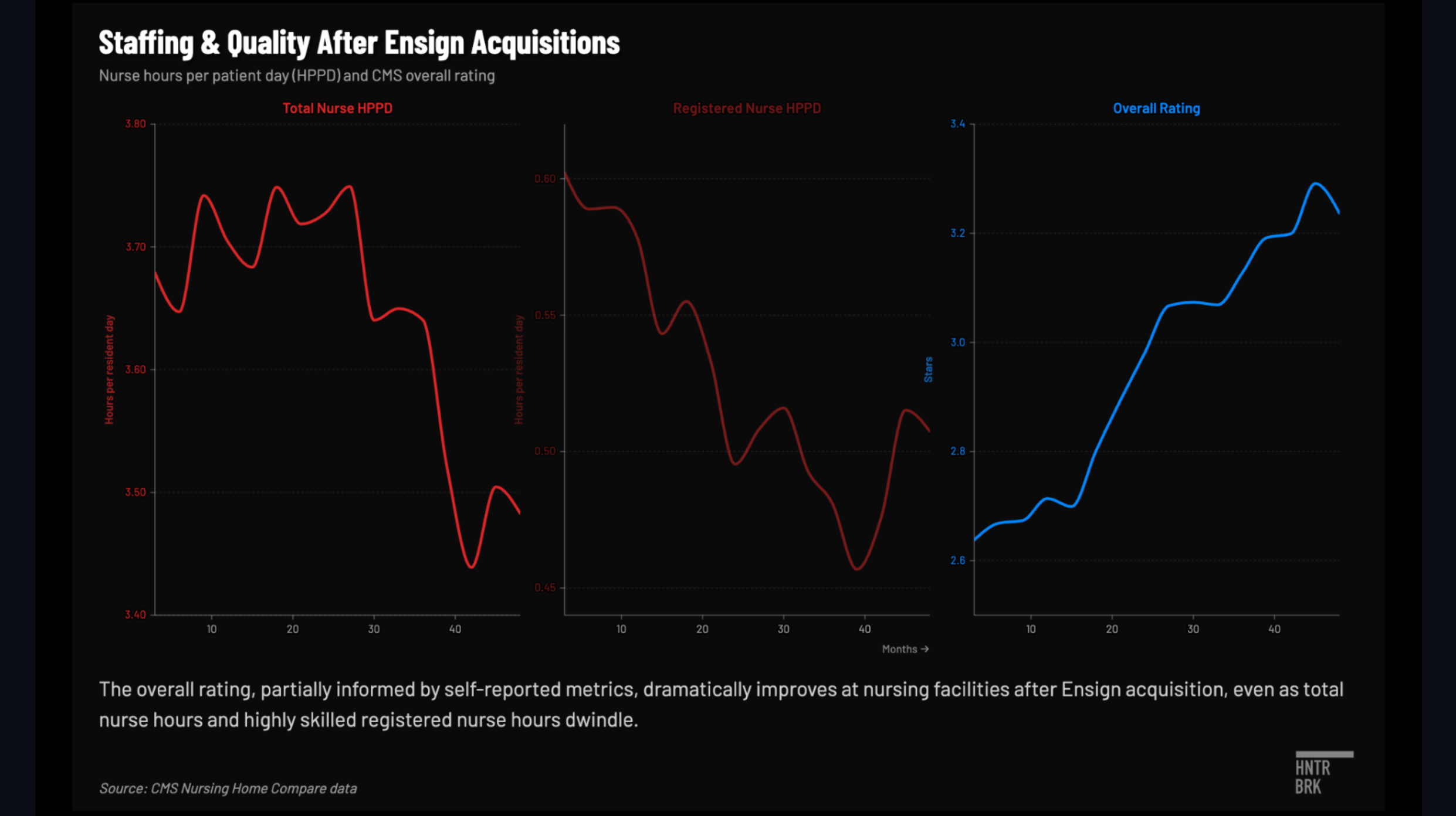
The Ensign Effect
Ensign is known for its aggressive acquisition strategy. Its financial filings attribute much of its historical growth to acquiring skilled nursing facilities and “transforming them into market leaders in clinical quality, staff competency, employee loyalty and financial performance.”
So, do these facilities become market leaders in quality and staffing after Ensign acquires them?
We sought to measure the difference in differences after Ensign acquisition, a test that has been applied to private equity influence in nursing homes.
Again, we identified Ensign-acquired facilities by scanning the CMS Provider Information snapshot from March, filtering for chain name contains “Ensign,” and collected all unique CCNs. This produced 329 unique Ensign facilities across 17 states. Ensign has publicly stated it has never sold a skilled nursing operation, which suggests the 329-facility list from March is a complete record. We then cross-referenced these 329 CCNs against the CMS Change of Ownership (CHOW) dataset to determine when each facility was acquired. Of these, 161 CCNs had CHOW records with acquisition dates. The remaining 168 had no matched CHOW date in the loaded source and were excluded from this analysis because we cannot determine their acquisition date. For the 161 matched CCNs, we used the most recent CHOW date as the acquisition date in cases where a facility had multiple ownership changes.
We again used 72 monthly CMS Provider Information snapshots spanning January 2020 through March. Each contains staffing hours, quality ratings, case-mix data, and facility characteristics for every Medicare/Medicaid-certified nursing home in the United States. We stacked all 72 snapshots into a single panel, where each observation is one facility in one month.
We excluded the 168 facilities without CHOW dates and applied a three-month buffer after each Ensign acquisition date because CMS staffing data is reported quarterly, so our observations come at least one quarter after the facility changed hands.
CMS only began publishing the raw case-mix index (CMI) in Provider Information files from July 2024 onward (18 of our 72 files). For snapshots on and after July 1, 2024, we used those raw figures.
To extend the acuity analysis across the full study period, we derived CMI from data available prior to July 2024. CMS used a legacy RUG-IV/STRIVE expected-hours methodology rather than PDPM. For that period, we used a separate RUG-based staffing case-mix factor:
RUG case-mix factor = Expected Hours / National Mean Expected Hours
So we compared facilities only within the relevant methodology era: RUG-based factors are compared to other RUG-based factors, and PDPM-based factors are compared to other PDPM-based factors. We didn’t mix the two.
We estimated the effect of Ensign acquisition on each staffing metric using a difference-in-differences (DiD) regression. We attribute the change in outcome to Ensign after removing the change that occurred across the entire industry over the same period.
We assigned facilities to treatment and control groups. The 161 Ensign-acquired facilities with known CHOW dates are our treated group. Facilities not acquired by Ensign during the study period are the control group. For treated facilities, observations before the acquisition date are considered pretreatment, and observations beginning 91 days after the acquisition date are coded as post-treatment; observations within the 91-day transition window are excluded. Because treatment timing varies across treated facilities, treatment is defined relative to each facility’s own acquisition date. Control facilities remain untreated in all periods.6
We found Ensign tends to acquire facilities that had been on a downward trajectory, then their overall star ratings increase.
Staffing falls at a statistically significant rate, particularly among RNs and CNAs. Facilities lose about nine minutes of nursing time per resident per day, 12 minutes after adjusting for acuity, meaning we’re comparing staffing to a unit of need rather than per resident.
Health inspections don’t change in a statistically significant way. Fines and penalties do drop meaningfully. Overall ratings show a V-shaped trajectory, consistent with Ensign targeting distressed facilities, followed by a rebound. But the model did not show a statistically significant improvement in overall rating.
Digging a little deeper, it depends on which quality metric we’re looking at.
After Ensign acquisitions, facilities showed statistically significant improvements on a couple of Tier 3 metrics Ensign can control, and somewhat better on Tier 1, but performed significantly worse on Tier 2 metrics like staff rating, total nurse hours, RN and CNA hours, licensed nursing hours, weekend total nursing and RN nursing.
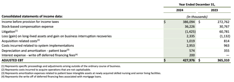
Proper Staffing Would Hurt Ensign’s Financials
Ensign’s 2024 financial results reflect the staffing the company chose, not the staffing its patients needed based on their acuity levels. Over a period in 2024 from July to November, replacing one with the other would have cost the company $161 million in additional cost of services expenses, according to a Hunterbrook analysis.
Hunterbrook examined how this adjustment would have impacted Ensign’s profit. We used Ensign’s 10-K (filed February 5, 2025) and its 2024 proxy statement.
After a $161 million increase in costs, net income drops about 30%, from $298 million to $207 million, and diluted earnings per share fall from $5.12 to $3.55. By the standards of a Wall Street earnings call, that hurts.
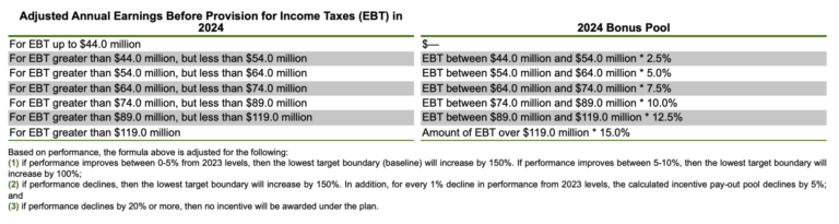
Ensign’s top five executives get paid by a formula, which is tied to a custom pre tax profit number the company defines in its proxy statement specifically for the purpose of sizing the bonus for these executives. Ensign calls it “adjusted earnings before taxes,” or “adjusted EBT.” It’s essentially pre tax earnings with a few company-specific adjustments.
Here is how it worked in 2024: The first $44 million of that profit number awards nothing to the bonus pool. The next $10 million earned feeds the pool at 2.5%. The next at 5%, the next at 7.5%, and so on in varying intervals, in a ladder that tops out at 15% on every dollar of adjusted EBT earned above $119 million.
In 2024, Ensign’s adjusted EBT came in at $428 million, which the formula converted into a pool of $48.8 million. Of that, $30.8 million was split among the top five executives. The remaining $18 million was carved out for other employees and for Insignia Pathways, a charity where Christopher Christensen, a founder of Ensign, and Barry Port, CEO of Ensign, sit on the board.
Now run the math again, but this time deduct the $161 million Ensign should have spent on nurses. Because the executive bonus pool is itself a function of adjusted EBT, a lower EBT produces a smaller bonus pool — which in turn reduces general and administrative expenses by roughly $43 million, partially offsetting the labor cost increase. After that offset, the adjusted EBT number lands at an estimated $310 million — a 15% drop from 2023.
The executive bonus plan has, by the company’s own disclosure, a few trip wires. For example, if the adjusted EBT drops by 20% or more in a year, the entire bonus is canceled. Ensign would clear this one.
But the other two kick in.
The bottom rung of the ladder — the threshold above which any pay begins to accrue — shifts up by 150%. And a separate rule kicks in that compresses the bonus pool by 5% for every 1% decline in company performance. A 15% shortfall, run through that math, leaves executives roughly a quarter of what they started with.
Multiply it all out, apply the same clinical/governance adjustment the compensation committee handed down in 2024, include a reduction proportional to the $18 million carve out, and the bonus pool collapses from $30.8 million to $3.6 million — an 88% cut.
In other words, the structure of Ensign’s bonus compensation formula is such that understaffing is more remunerative for its top five executives than staffing at appropriate levels.
A few items in our model do not move. For example, revenue stays flat because this is not about charging less; it is about spending more. Other expenses, interest, and litigation accruals all stay put; we assumed none of them respond to a one-year staffing decision. The 22.7% effective tax rate is kept the same, too. The bonus pool cascade is solved iteratively because the size of the cascade depends on the EBT decline, and the EBT decline depends on the cascade. The model converges to a 15% YoY decline, below the 20% kill switch threshold.
A few things the model leaves on the table. Our reporting found that Ensign facility administrators can be paid bonuses determined by their building’s profits. Profits at the building drop in the counterfactual, so their pay would presumably drop, too.
It’s important to remember the compensation committee has broad discretion, so the $3.6 million figure is based on the disclosed plan, not necessarily what might actually happen.
Selected Tests Don’t Link Need and Staffing
Data showed that Ensign residents have higher acuity levels — or are sicker — on average than residents in non-Ensign facilities.
We explored whether acuity drove staffing decisions at Ensign facilities, or in other words what the relationship was between acuity, measured by case-mix index (CMI), and total nursing hours per resident per day (HPRD).
Again we identified Ensign-acquired facilities by scanning the CMS Provider Information snapshot from March, filtering for chain names containing “Ensign,” and collected all unique CCNs. This produced 329 unique Ensign facilities across 17 states.
We then cross-referenced these 329 CCNs against the CMS Change of Ownership (CHOW) dataset to determine acquisition dates. 161 CCNs had CHOW records; the remaining 168 are Ensign CCNs with no matched CHOW date. We excluded instances where a facility was not yet under Ensign ownership and applied a three-month buffer for acquired facilities because CMS staffing data is reported quarterly through the Payroll-Based Journal (PBJ) system. So early snapshots may still reflect the prior operator’s staffing.
After dropping 65 observations with missing or non-positive acuity or staffing values, the final sample contained 5,996 monthly observations across 329 facilities.
We first computed the Pearson correlation coefficient between acuity and staffing to measure their relationship. Nationally, the correlation was strong.
But this mixes together two different sources of variation: permanent differences between facilities (a California facility versus a Texas facility) and changes within the same facility over time (the same building getting sicker patients from one month to the next).
So we tested whether the national correlation held up within individual states by computing the same Pearson correlation separately for each of Ensign’s 17 states.
The results were sharply divided.
In some states, the link was strong: California (r = 0.85, p < 0.001), Arizona (r = 0.87, p < 0.001), Utah (r = 0.97, p < 0.001). In others, there was no statistically significant relationship at all: Texas (r = 0.33, p = 0.002 — statistically significant but acuity explains only 11% of staffing variation), Tennessee (r = 0.34, p = 0.38), Nebraska (r = 0.10, p = 0.84), Kansas (r = 0.46, p = 0.16), Idaho (r = 0.46, p = 0.10).
We grouped states into acuity bands where average CMI was within a few percentage points, then compared their staffing levels.
Tennessee and California have nearly identical average acuity (a difference of 0.015 CMI points, or about a 1.0% relative increase), yet California’s average HPRD is 4.32 while Tennessee’s is 3.53 — a roughly 20% difference.
Texas and Colorado have about the same acuity (1.32) and staffing differs by only 1.8%.
If acuity were the primary driver of staffing, states with matching acuity levels might have roughly matching staffing levels.
We found that they don’t.
We quantified the magnitude of the disconnect using a coefficient of variation (CV) analysis, which measures how much a variable varies relative to its own mean. Across Ensign’s 17 states, staffing varied 2.6 times more than acuity across states.
If staffing were proportionally driven by acuity, we might expect to see them move in sync. They don’t. The gap suggested variation in staffing across states is attributable to factors other than patient acuity.
We used a panel analysis to isolate within-facility variation and test whether changes in acuity at the same facility over time led to changes in staffing.
We tried four regression models.
- Ordinary Least Squares regression yielded a coefficient of β = 1.95 (p < 0.001), suggesting that an increase in CMI was associated with more HPRD. But this model compared different facilities to each other and conflated permanent between-facility differences with within-facility dynamics.
- A facility fixed-effects model — which controls for every permanent characteristic of each facility by using only within-facility variation over time — yielded β = 0.38 (p = 0.17, not statistically significant).
- A two-way fixed-effects model adding time fixed effects to absorb common shocks across all facilities yielded β = 0.37 (p = 0.21, not statistically significant).
- Adding occupancy and facility size controls produced β = 0.31 (p = 0.27, not statistically significant).
So we saw the coefficient drop from 1.95 to 0.31 when we shifted from comparing facilities to each other, to tracking the same facility over time.
Similarly to Simpson’s Paradox, the strong correlation vanishes when we look within facilities. This suggests the national correlation is driven by the fact that some facilities permanently have both higher acuity and higher staffing — not by dynamic staffing adjustments in response to patient needs.
We also did three additional tests to probe causality.
- A lagged model testing whether last month’s acuity predicts this month’s staffing produced β = 0.34 (p = 0.19).
- A first-difference model, which tests whether month-to-month changes in acuity are associated with month-to-month changes in staffing, produced β = 0.00 (p = 0.98).
- A reverse-direction panel regression checking whether lagged staffing predicts current acuity produced β = 0.01 (p = 0.06).
None of these dynamic tests showed a statistically significant relationship: If a facility’s patients get sicker from one month to the next, these tests don’t show staffing adjusting.
We tried to rule out the possibility that our outcome is the result of outliers, functional form, or sample composition.
We winsorized CMI and HPRD at the first, second, and fifth percentiles to remove extreme observations — and the coefficient collapsed to essentially zero, and all were not significant.
We attempted a log-log specification to test for nonlinear elasticity — meaning we tested whether facilities respond proportionally rather than in fixed amounts (like 10% sicker patients getting 10% more nursing time), a pattern a straight-line model could miss. Even allowing for that proportional response, no link appears.
We restricted the sample to a balanced panel of facilities present in at least 80% of months — still we didn’t get a significant result. Among facilities that consistently report, staffing doesn’t seem to track acuity.
We separated legacy facilities and acquired facilities. Neither group significantly adjusts staffing to changes in patient acuity.
Every non-significant result points the same direction: Within-facility acuity does not predict staffing.
Day-to-Day HPRD
Some states mandate nursing homes provide a minimum number of hours per resident per day. California’s attorney general sued a chain on the grounds it failed to meet that standard, citing specific days.
So Hunterbrook sought to identify nursing homes whose staffing fell below minimum hours-per-resident-day floors on individual days.
We built a day-level dataset from CMS’s Payroll-Based Journal (PBJ) Daily Nurse Staffing files, drawing every quarterly file available from 2020 through the third quarter of 2025. For each facility-day, we pulled the CMS Certification Number, facility name, location, work date, MDS census, and reported nursing hours by staff type.
We converted the raw PBJ staffing entries into total nursing hours per resident day, or HPRD. Registered nurse hours included RN director of nursing, RN administrative, and RN floor hours. Licensed practical nurse hours included LPN administrative and LPN floor hours. Nurse aide hours included CNA, nurse aide in training, and medication aide hours.
We summed those categories to calculate total nursing hours, then divided by the MDS census for that facility on that day. We calculated HPRD only when a facility-day had a valid positive resident census.
We then asked a simple question: On which days did reported total nurse staffing fall below a regulatory floor?
For state minimums, we used the HPRD thresholds established in Kansas, California, Tennessee, and Washington, and compared each facility-day’s total nurse HPRD with the applicable state threshold.
We separately created a federal benchmark flag. CMS’s 2024 final rule set a total nurse staffing standard of 3.48 HPRD, which was effective June 21, 2024, but rescinded as of February 2.
We filtered the daily dataset to rows where either the state-floor flag or federal benchmark flag was triggered. This produced a day-by-day list of facilities whose reported staffing fell below at least one floor. The statutory minimums are set at the tenths or hundredths place (two places after the decimal). We did not round off, and counted as a violation days that fell even slightly below the floor set by law (for example, 3.497007299 is less than California’s minimum of 3.5).
We then added Ensign ownership information by starting with a known list of current Ensign facility CCNs and adjusting for facilities acquired during the observation period.
We filtered CMS change-of-ownership records to skilled nursing facility transactions, then matched those records to the current Ensign CCN list at the facility level. For matched rows, we treated a facility as an Ensign acquisition only when the joined provider fields identified PROVIDER_Chain Name as containing “Ensign,” using PROVIDER_Chain ID 507 as a fallback check, and we kept the earliest CHOW effective date as the ownership start date. Current Ensign CCNs without a matched Ensign CHOW record were treated as already Ensign-owned at the start of the study window.
For facilities acquired during the study period, we counted a day as Ensign only if it occurred on or after the acquisition date.
Finally, we collapsed the day-level data to a facility-level summary. For each CCN, we counted days below a state minimum, days below the federal benchmark, and preserved the list of violation dates.
We then compared Ensign and non-Ensign facilities by average violation days, median violation days, and the share of facilities with at least one flagged day. Because violation counts are skewed, we used a Mann–Whitney U test to compare whether Ensign and non-Ensign facilities showed a similar distribution of federal violation days. Ensign’s was statistically significantly higher.
Using a two-proportion test, we tested whether Ensign facilities were more likely than non-Ensign facilities to have at least one flagged state-floor violation day. We found they were.
Andrew Ford is an investigative journalist who exposed systemic flaws and prompted reforms in healthcare, business, policing, and state government. His reporting was published by ProPublica, USA Today, The Arizona Republic, Asbury Park Press, and Florida Today. He holds a journalism bachelor’s from the University of Florida and received a data analytics master’s from Georgia Institute of Technology. He is based in Phoenix, AZ.
Michelle Cera trained as a sociologist specializing in digital ethnography and pedagogy. She completed her PhD in Sociology at New York University, building on her Bachelor of Arts degree with Highest Honors from the University of California, Berkeley. She has also served as a Workshop Coordinator at NYU’s Anthropology and Sociology Departments, fostering interdisciplinary collaboration and innovative research methodologies.
JD Jean-Jacques joined Hunterbrook from Goldman Sachs, where he worked as an investment banker. He was editor-in-chief of Howard University’s newspaper, The Hilltop, and wrote for The Exonian at Phillips Exeter Academy. Among other recognitions, JD was a White House Correspondents’ Association Scholar and was named Student Journalist of the Year by The National Association of Black Journalists. He graduated from Howard with a B.A. in history.
Wendy Nardi joined Hunterbrook after working as a developmental and copy editor for academic publishers, government agencies, Fortune 500 companies, and international scholars. She has been a researcher and writer for documentary series and a regular contributor to The Boston Globe. Her other publications range from magazine features to fiction in literary journals. She has an M.A. in Philosophy from Columbia University and a B.A. in English from the University of Virginia.
Laura Wadsten is an investigative journalist specializing in healthcare. She began her career reporting on antitrust and healthcare as a Correspondent for The Capitol Forum, a premium financial publication. Laura was a Hodson Scholar and Editor-in-Chief of The News-Letter at Johns Hopkins University, where she earned a B.A. in Medicine, Science & the Humanities.